
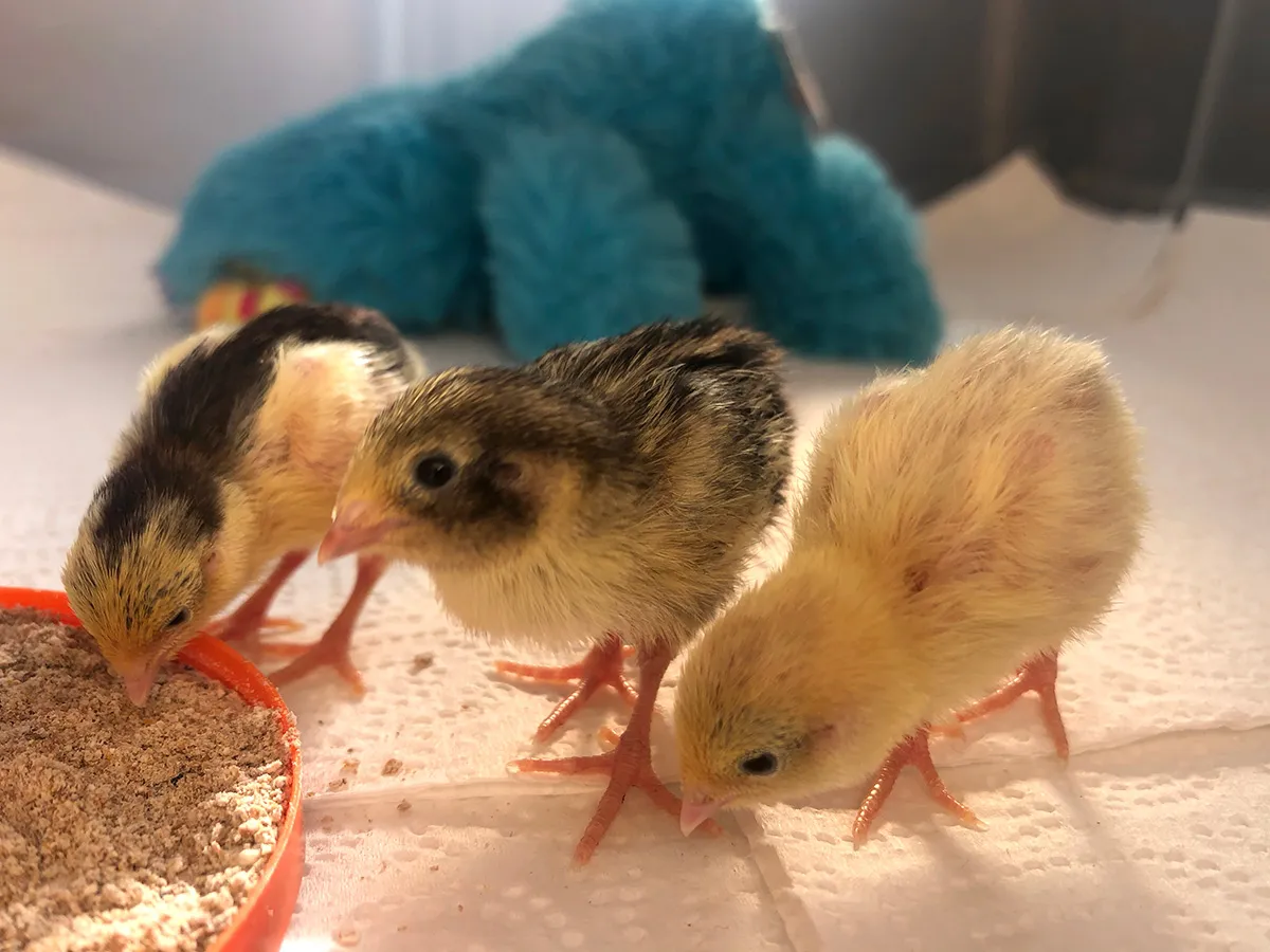
In 2020, I hatched 6 Chinese painted quail chicks in my London flat.* It was something I’d planned meticulously—perfecting the incubation, setting up ideal habitats, and even filling their water dishes with marbles so they couldn't fall in. However, there was one element I couldn't nail… the feed.
Quail chicks need a feed that is: A. non-medicated, B. finely ground, and C. very high in protein. The best I could do for them was a turkey starter, pulverised and topped up with boiled egg to raise the protein content.
It turned out I wasn't the only one facing this issue. After scouring multiple online groups and forums, it was clear that the ideal commercial feed simply didn't exist. Others had been making expensive special requests at local mills, adding their own supplementary ingredients, or resorting to generic feeds that impacted their birds' health.
“Wouldn't it be great", we discussed, “to be able to create and buy feed mixes that actually meet our birds' specific needs?"
What makes finding the right feed so difficult?
Tackling this issue required a broader understanding. I interviewed four very different bird owners, and each one told me they couldn’t trust commercial feeds. Adrienne struggled with getting her parrot to try new foods, Craig had a large collection of birds to track, and Galit’s eclectus parrot had some difficult health complications.
Synthesising the most important points and observations (using empathy maps) revealed a few common themes:


He’s very picky! He will only eat certain fruit and veg … that’s chopped in a specific way.

It can be hard to find trustworthy information, especially for the less common species.


A lot of what I do is dictated by the weather … that influences what they have and how much.
I make my own hand blended mixes; I want to know where the ingredients come from.

Which formed some key insights:
Many owners have a problem with their birds being picky eaters and causing wastage
Pet birds require different types and quantities of feed depending on the season
Some bird owners find it hard to trust the provenance and suitability of ingredients in commercial mixes
We can see differing frustrations between those with larger outdoor collections, and single indoor birds. Personas are a useful way to keep these two groups with differing needs in mind going forward:
Mehreen has one parrot that lives inside with the family. When she adopted him, he was eating pre-made mix that wasn’t particularly organic or healthy, especially for his species. She’s since added fresh food to his diet, and faced some challenges with him adapting to change.
Be able to give her bird treats without worrying about the potential health impact.
Be confident that the feed she provides is right for her bird’s species and situation.
Make her bird’s diet as complete and organic as possible.
Her bird is very picky about food, and often rejects new things.
Most pre-made mixes aren’t suitable for her bird’s species, which has specific needs.
Difficulty getting her bird to switch to a new feed, as he prefers previous unhealthy ingredients.

David is a hobby-breeder who takes the health of his many outdoor birds very seriously. He knows each one and their habits well, and can tell when something’s wrong. He wants to give them a natural life, and creates his own feed mixes to do so, altering them through the seasons.
Feed a large group of birds the healthiest diets possible.
Easily vary each bird’s diet depending on the season.
Reduce wastage, and therefore expense, without compromising on quality.
A lot of new feeds and ingredients go to waste when birds reject them.
Most available mixes are too high in fat and especially unhealthy over the long term.
Preparing bespoke feed takes a lot of time every day.
David and Mehreen are already aware of their birds' specific needs, and the problems with commercial feed. Once the business grows, there would be more budget to market to and build for a third user type who needs more guidance and education.
I continued to narrow down the key issues with user stories, giving a solid starting point for defining what the product should achieve:
As an owner of a rare parrot, I want to find food that's appropriate for his species, so I can trust he's not getting anything unhealthy.
As a hobby breeder with lots of birds, I want to vary their diet throughout the year, so they're always in peak health.
Figuring out what to build
To start defining what my product should be and achieve, I needed to specify one main problem to solve for. Based on my primary persona's story, I set out a problem statement:
Mehreen is an owner of a rare bird, who needs to find specially tailored feed because many off-the-shelf mixes aren't suitable for his species.
This is an important problem that seriously impacts a bird's health (rather than just being an inconvenience), and came up in a lot of interviews and secondary research.
So how can I create a solution that’s appropriate, trustworthy, and has a place in the market?
There are no direct competitors, but perhaps I could learn from similar services in adjacent spaces? I audited two tailored dog food retailers, a pick-and-mix wild bird feed brand, and a create-your-own protein bar business. Focussing on their customisation processes, I noted some key differentiators—notably around the importance of clear language, digestible information and progressive disclosure.
To understand what features would serve my users best, I laid out a unique value proposition that addressed my personas' needs and frustrations:
Create your own custom bird feed mix
Set your birds’ species and specific needs
See visual nutrition analysis and tips
Choose from 100% certified organic ingredients
Auto-adjust your mix depending on the season
We now have a list of the most useful features to start developing.
Scope and structure
I limited the initial scope to an iOS app. I aimed to make my designs as realistic as possible—that meant considering the practicalities of the structure and elements for (hypothetical) development. Images must swap out cleanly, edge cases would be planned for, and business needs should be considered as well as user needs.
With a goal statement set out:
The app will let users who aren't satisfied with off-the-shelf products, create their own feed mix by offering complete control over the ingredients. I will measure effectiveness through usability testing low and high fidelity designs.
I started generating loose ideas by asking:
How might we allow users to customise their bird feed in an informed way?
With a "no bad ideas" mindset, I sketched some rough solutions addressing persona needs in different ways.


Starting loose means I can generate concepts I might not normally consider.


We could help David limit waste by asking how each bird reacted to an ingredient, or offer free samples to try ahead of making a mix.


Mehreen could find out what’s best for her bird using a knowledge base, or a questionnaire that saves their specific needs.


Users might be guided through creating a mix with detailed nutritional breakdowns, or broader guidance on macro balances with actionable fixes.
I started generating loose ideas by asking:
How might we allow users to customise their bird feed in an informed way?
With a "no bad ideas" mindset, I sketched some rough solutions addressing persona needs in different ways. Starting loose means I can generate concepts I might not normally consider.
We could help David limit waste by asking how each bird reacted to an ingredient, or offer free samples to try ahead of making a mix.
Mehreen could find out what’s best for her bird using a knowledge base, or a questionnaire that saves their specific needs.
Users might be guided through creating a mix with detailed nutritional breakdowns, or broader guidance on macro balances with actionable fixes.
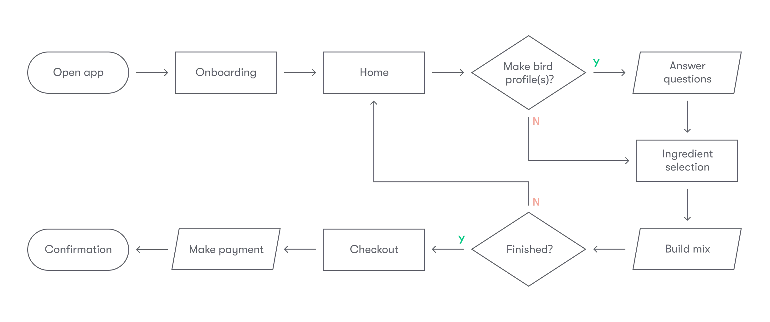
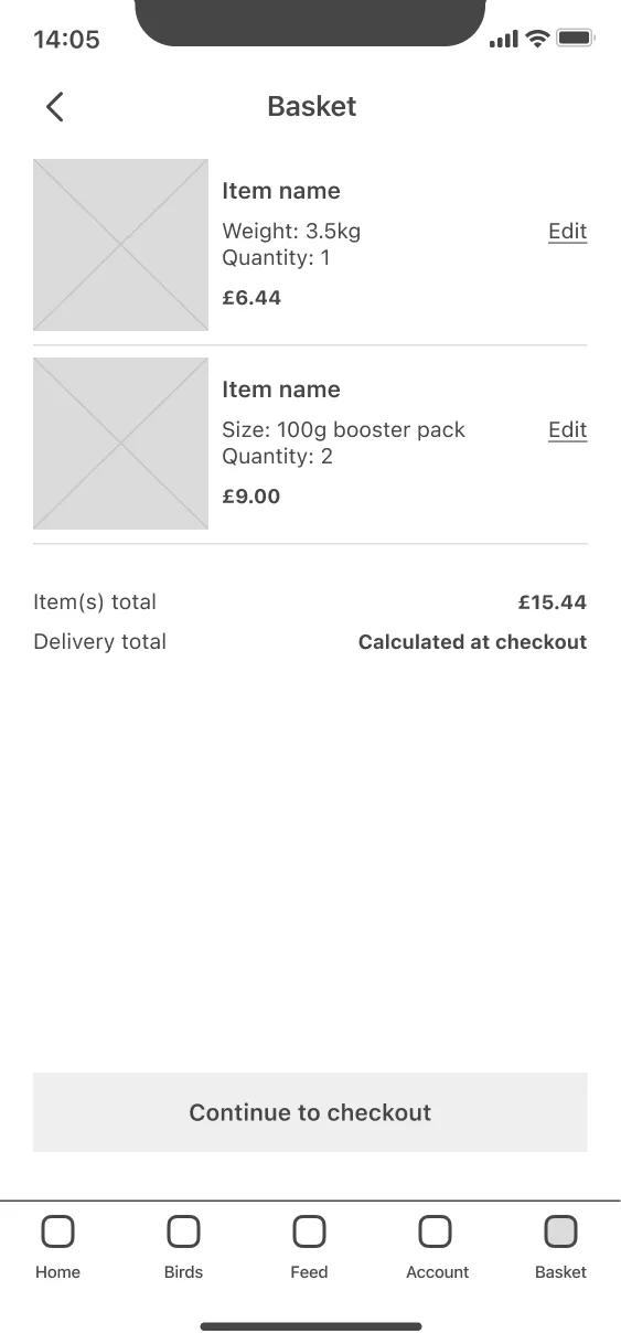
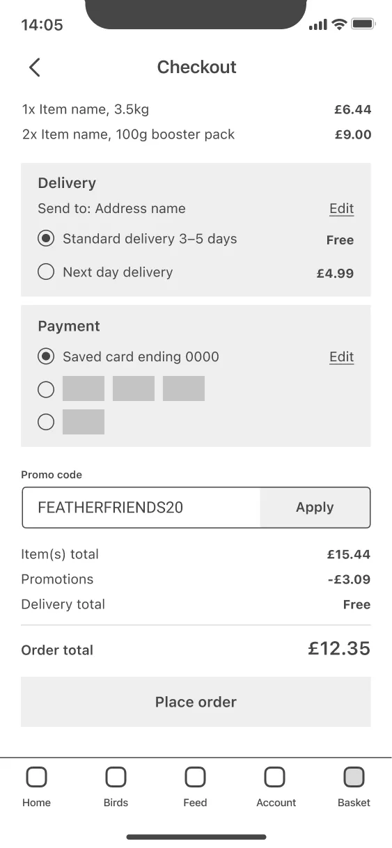
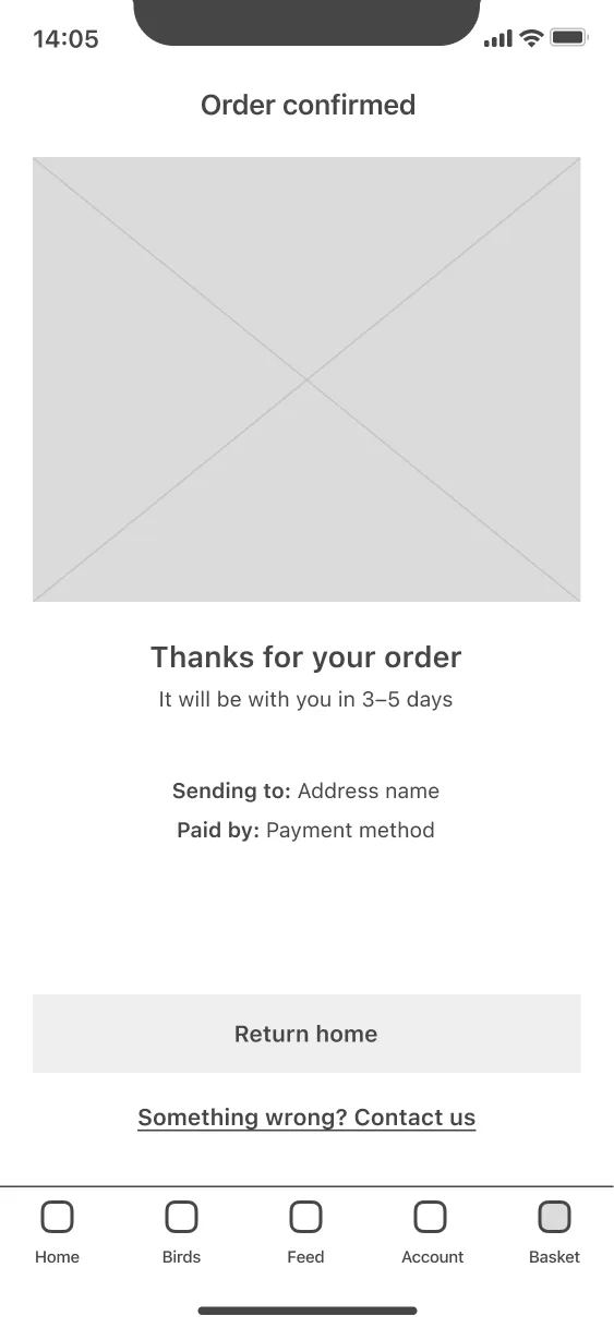
The most important action a new user could take is to create and order a mix— this is our primary flow. I charted a basic version, taking into consideration choices users might want to make, and specifying a clear happy path, which would allow me to start structuring the content within the app.

Considering the interface
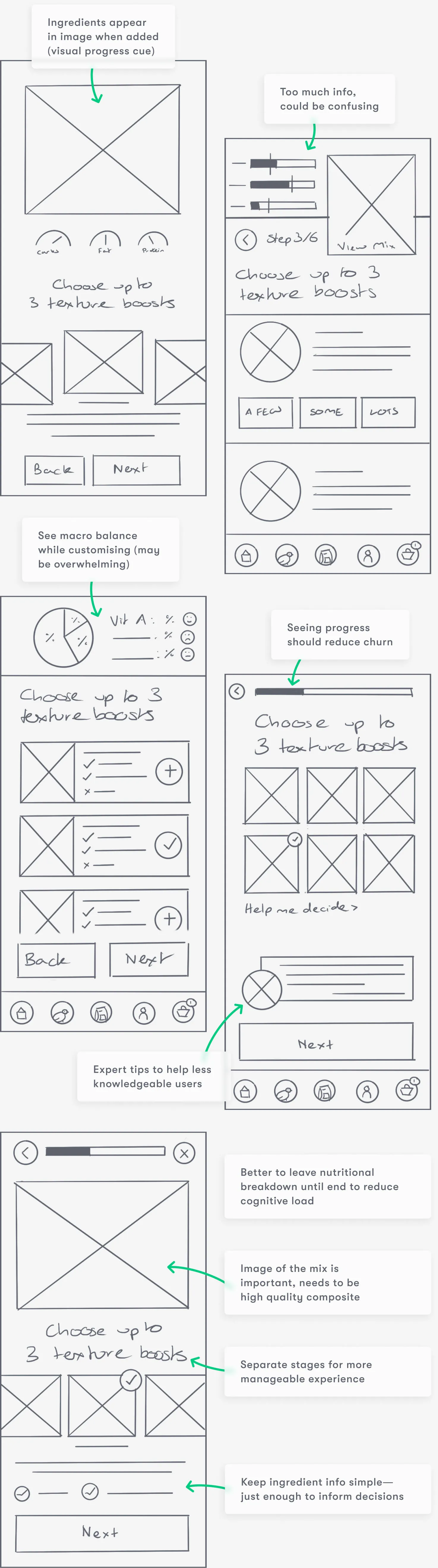
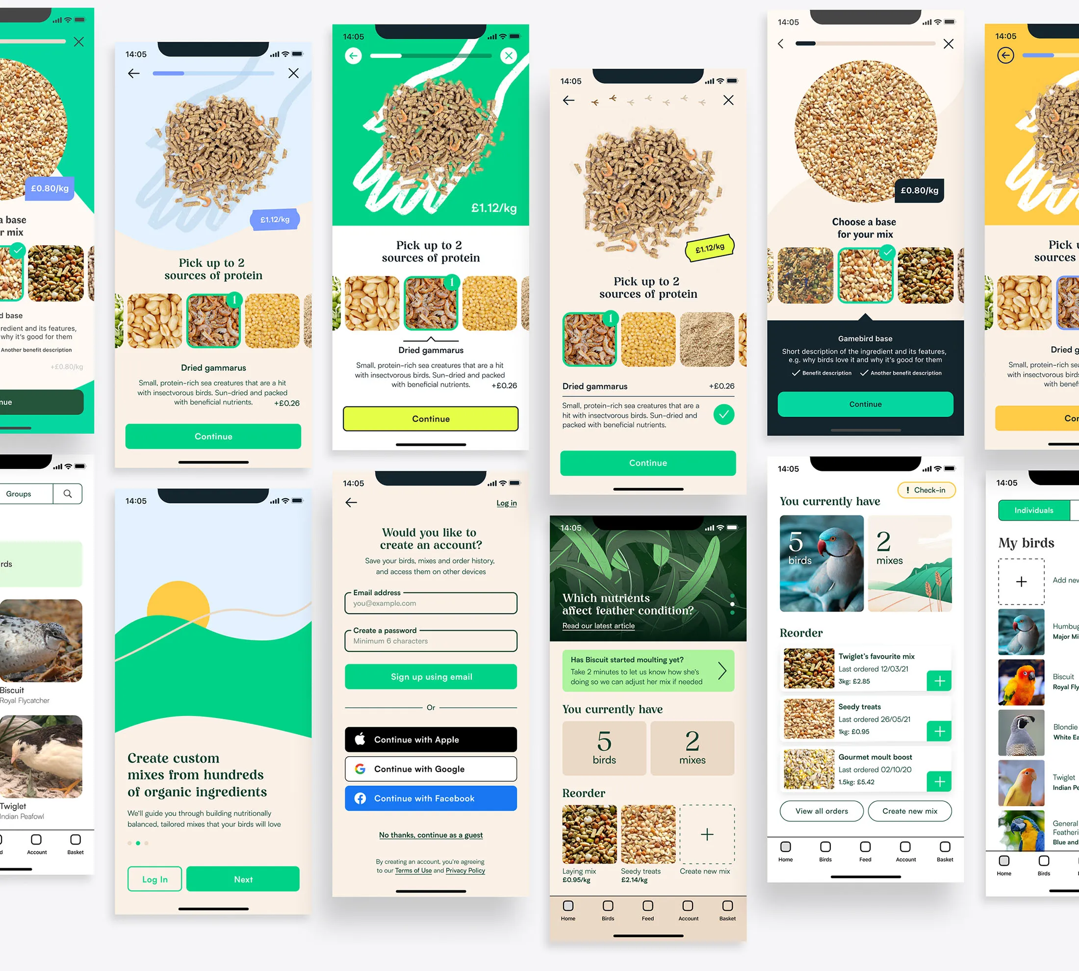
With the foundations in place, I used wireframes to draft different versions of each core screen in the primary user flow.
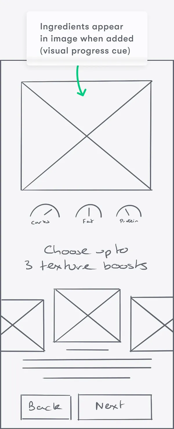
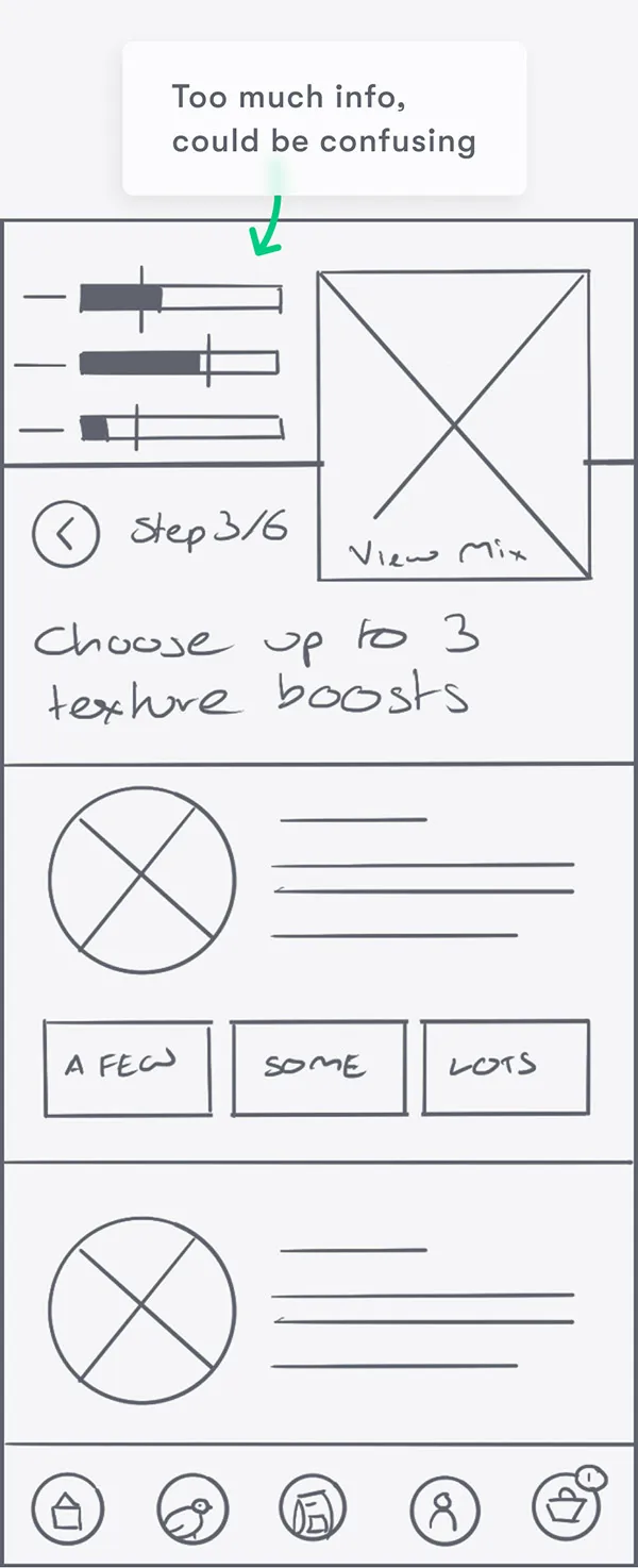
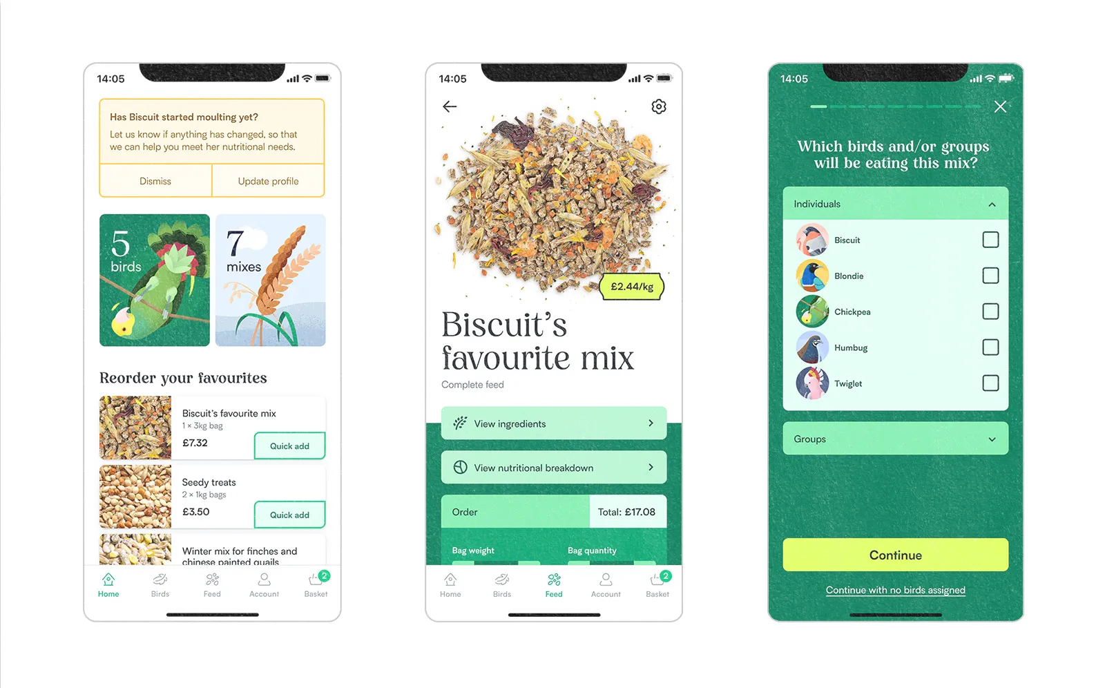
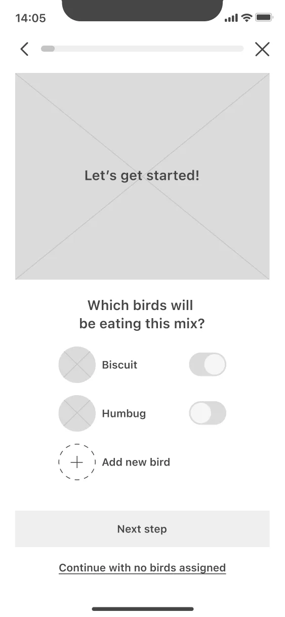
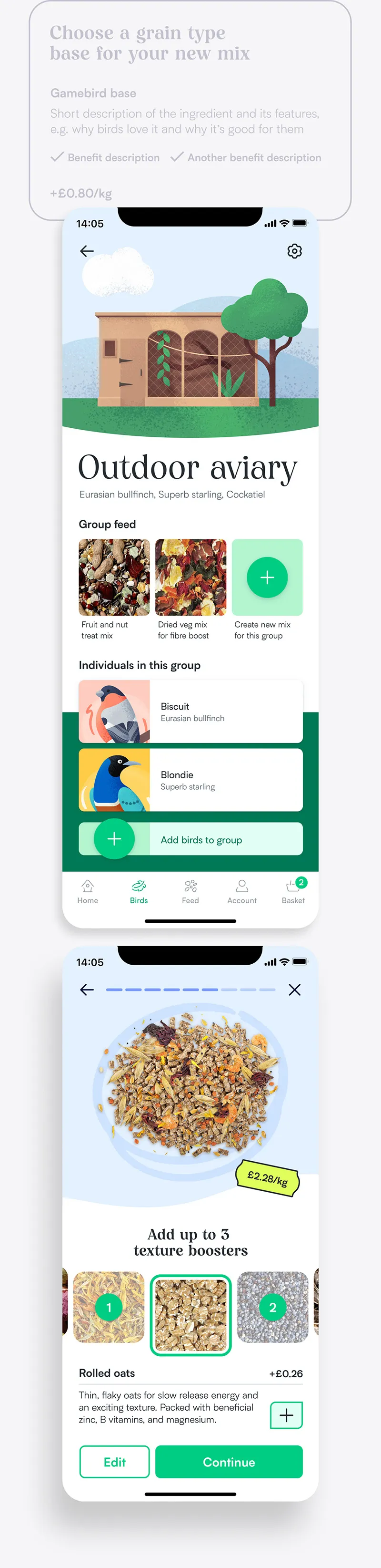
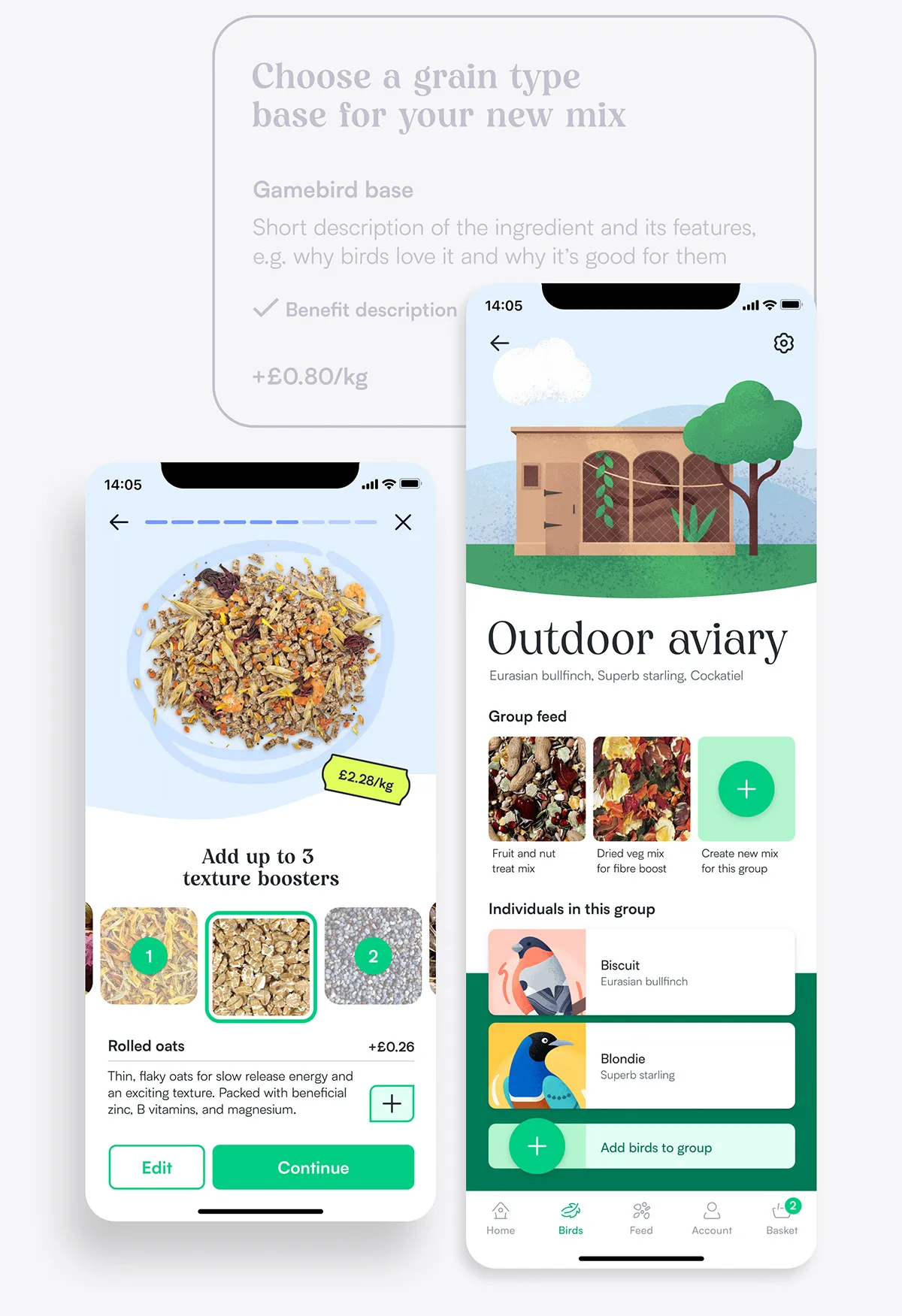
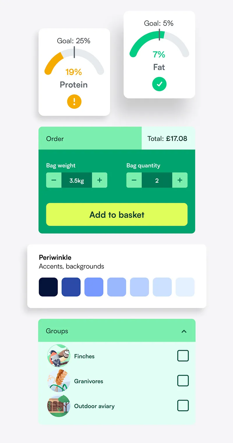
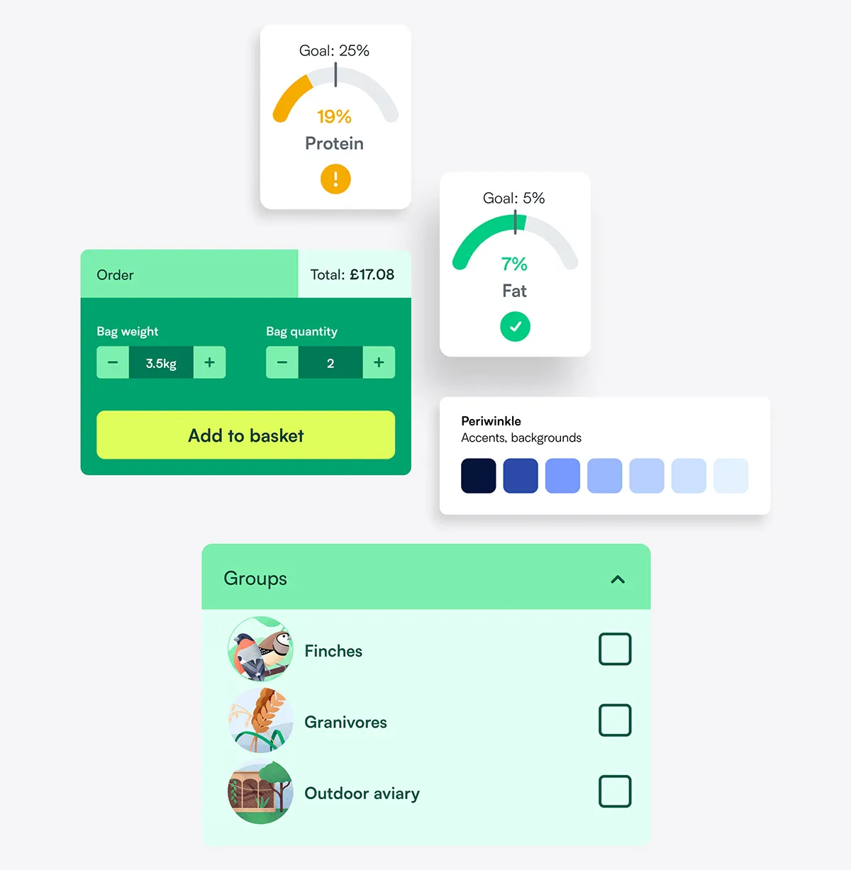
Exploring variations for the mix customisation process, I could see that a hero image of the mix would be a key helper in seeing results. It also avoided information overload from text and graphs.
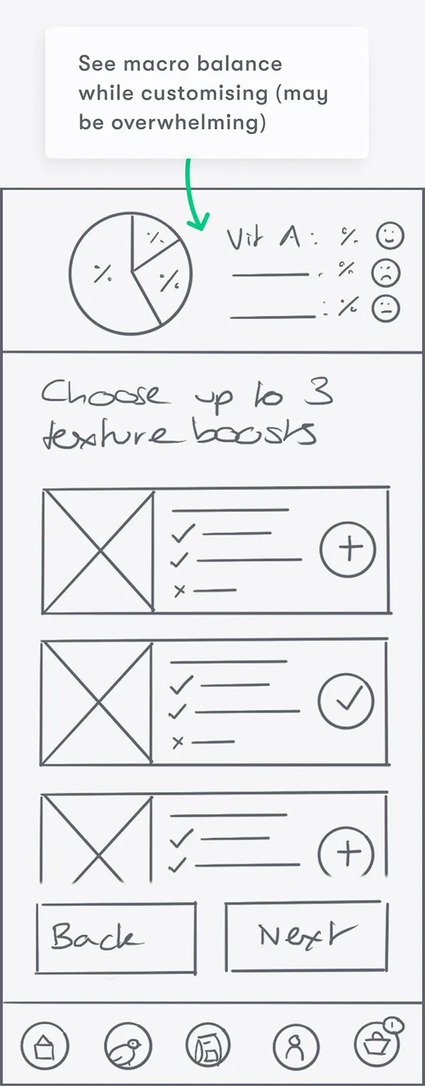
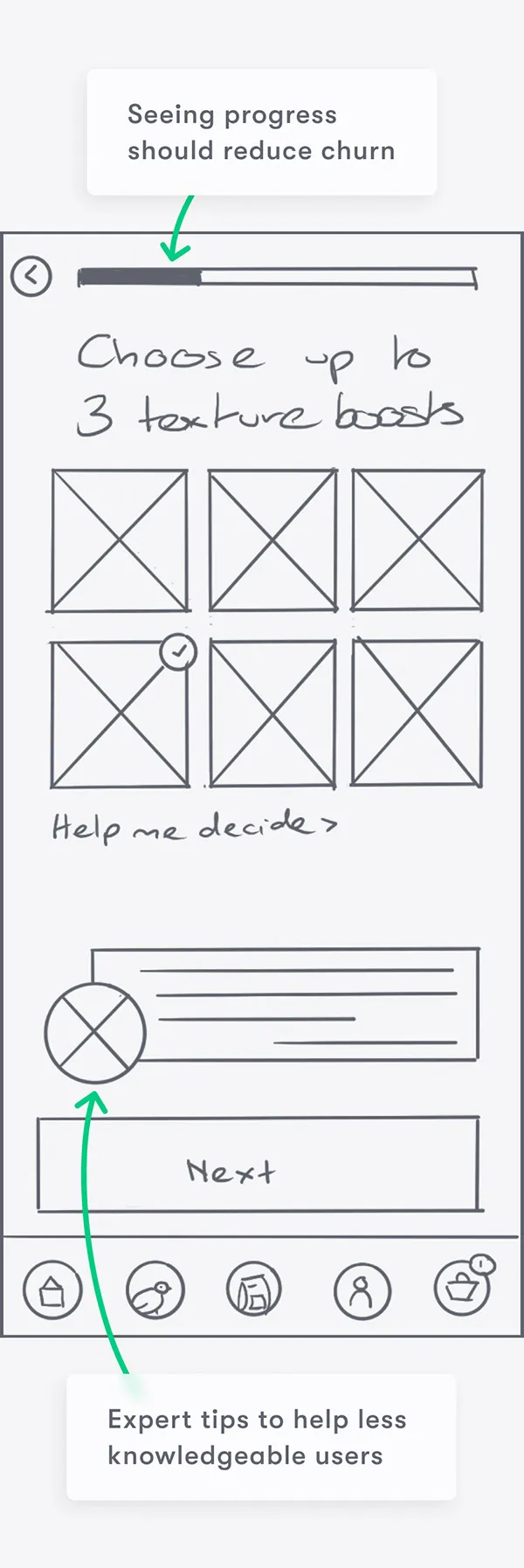
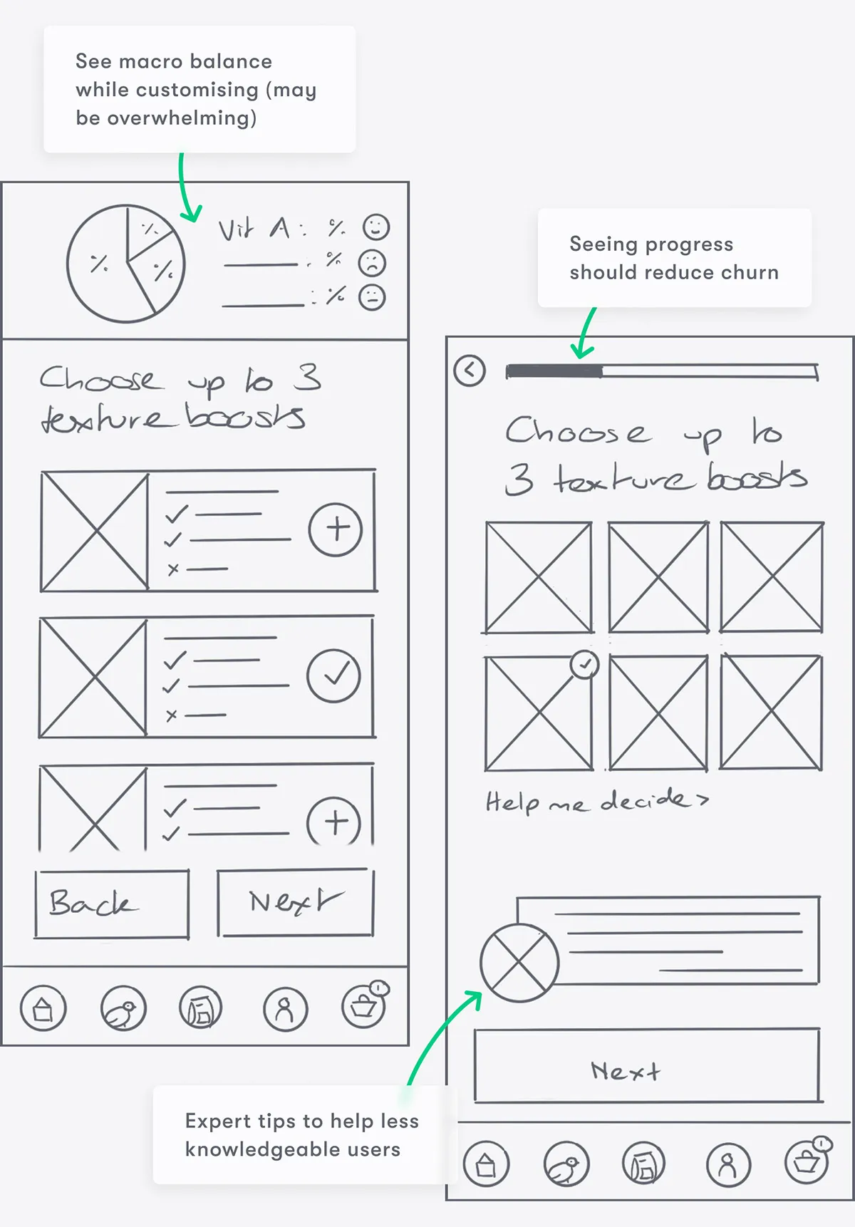
Info on ingredients would help users like Mehreen make informed decisions, but detailed charts throughout could be overwhelming.
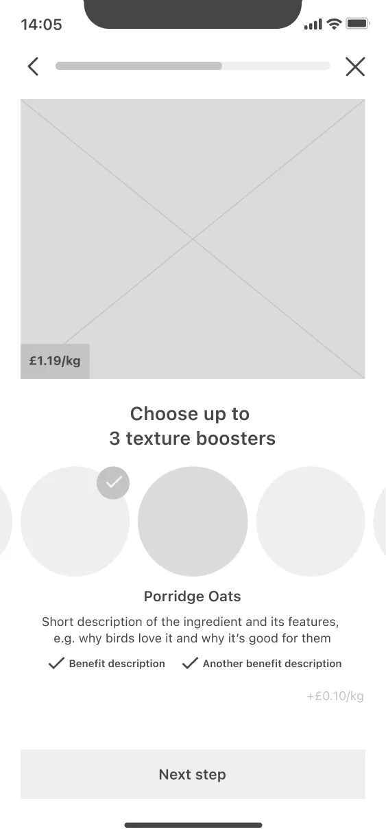
To help, I could break it into digestible stages, with expert prompts and a bar to show progress.
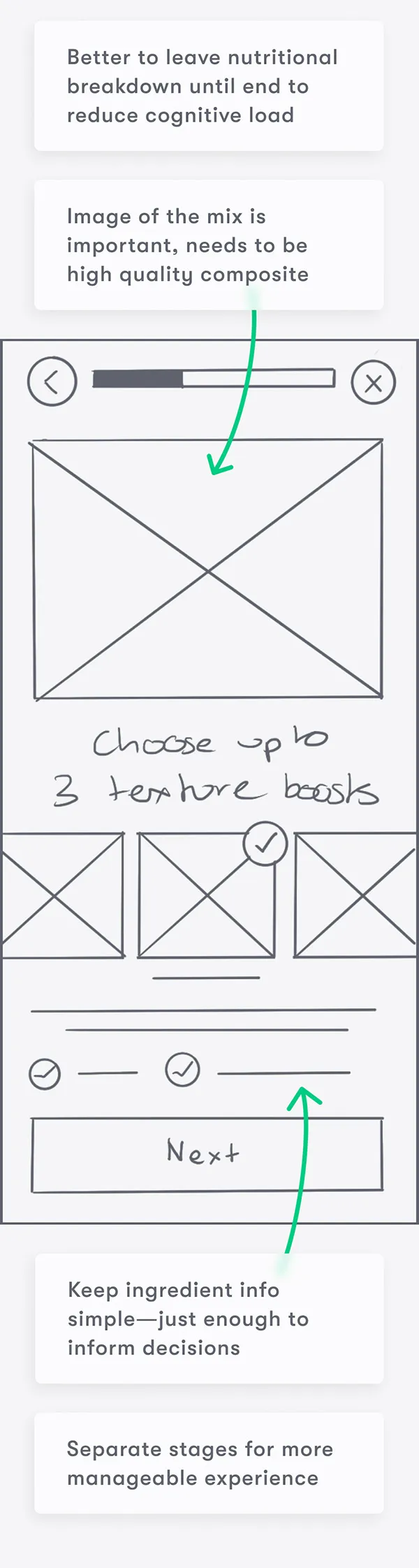
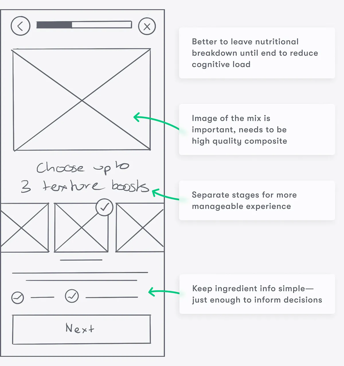
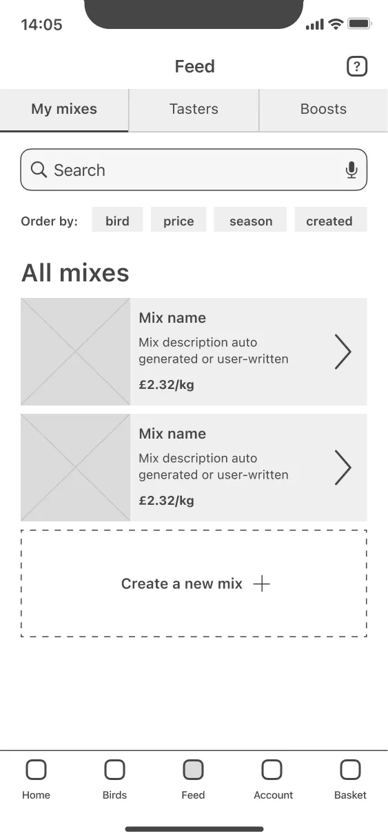
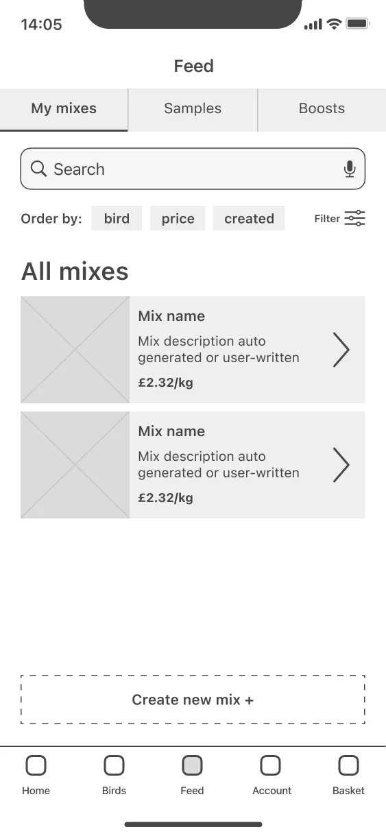
Using the most appropriate components together resulted in a refined wireframe with all the content needed for the mix customisation process.
I used the same process to produce wireframes for other core screens.
I took the refined wireframes for all my core screens into Figma, making small changes to keep layouts consistent. I also re-evaluated some of my initial ideas from the user flow…
… after examining the experience holistically I realised that integrating bird profile creation into the mix customisation flow could be overwhelming and time consuming for new users.
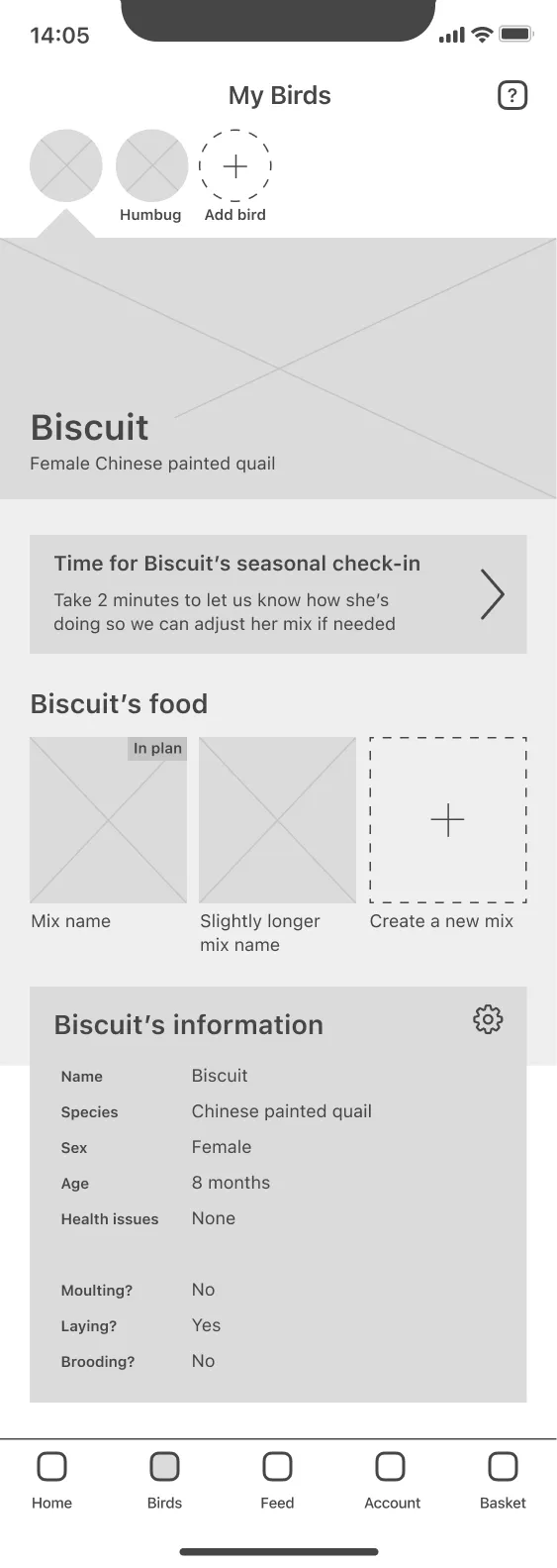
Instead, I broke the setup questions down into relevant sections as a form of progressive disclosure, i.e. using separate bird and mix creation flows.
This was a solid foundation to build on. I created a minimal prototype and sought critique from mentors and other designers.
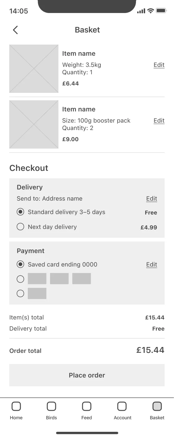
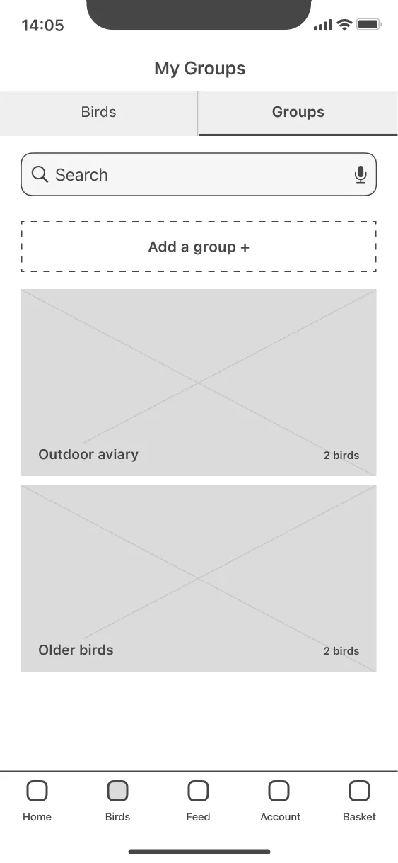
I was lucky enough to get some insightful feedback, and implemented several key points. For example, I added a function to group the birds, which would be useful for David, our hobby breeder persona. I also split the checkout process into more steps to add positive friction, as saving taps here came at the expense of clear comprehension:
Considering the interface
With the foundations in place, I used wireframes to draft different versions of each core screen in the primary user flow.
Exploring variations for the mix customisation process, I could see that a hero image of the mix would be a key helper in seeing results. It also avoided information overload from text and graphs.
Info on ingredients would help users like Mehreen make informed decisions, but detailed charts throughout could be overwhelming.
To help, I could break it into digestible stages, with expert prompts and a bar to show progress.
Using the most appropriate components together resulted in a refined wireframe with all the content needed for the mix customisation process.
I used the same process to produce wireframes for other core screens.
I took the refined wireframes for all my core screens into Figma, making small changes to keep layouts consistent. I also re-evaluated some of my initial ideas from the user flow…
… after examining the experience holistically I realised that integrating bird profile creation into the mix customisation flow could be overwhelming and time consuming for new users.
Instead, I broke the setup questions down into relevant sections as a form of progressive disclosure, i.e. using separate bird and mix creation flows.
This was a solid foundation to build on. I created a minimal prototype and sought critique from mentors and other designers.
I was lucky enough to get some insightful feedback, and implemented several key points. For example, I added a function
to group the birds, which would be useful for David, our hobby breeder persona. I also split the checkout process into more steps to add positive friction, as saving taps here came at the expense of clear comprehension:
How will users behave?
The low fidelity prototype was ready to be put in the hands of potential users. I recruited one moderated and seven unmoderated participants for a usability study to observe how easy or difficult users found setting up bird profiles and creating a mix.
Testing early and often is vital, especially for a new product
Participants were presented with tasks matching the key needs of each persona (adding a bird and creating a group), as well as the most important task for the business: creating and ordering a mix.
After the studies, I synthesised key points and observations using an affinity diagram, which revealed a few patterns, namely:
Both the tab bar and thumbnails were used by an equal number of participants—both have value for navigation
5 of 7 participants said they found the tasks easy to complete, but 2 struggled to find the “add a group” button
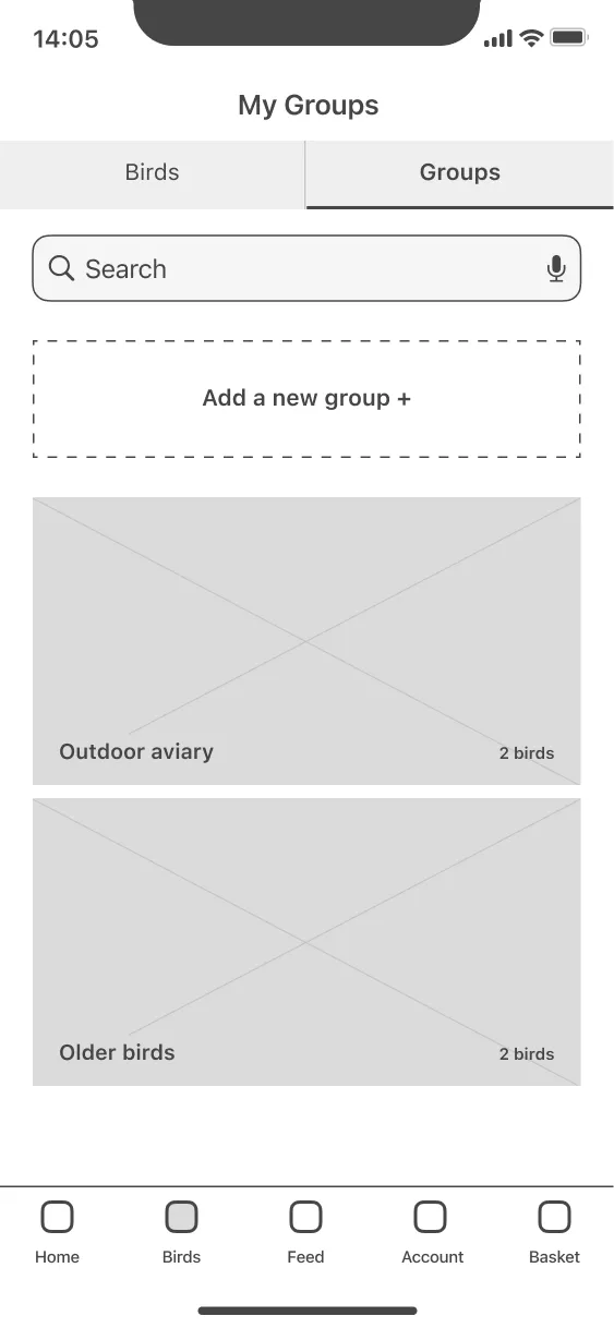
We now had data-led benchmarks for comparison with future tests, and a clear priority for the next iteration had emerged: draw attention to the "add new" buttons.
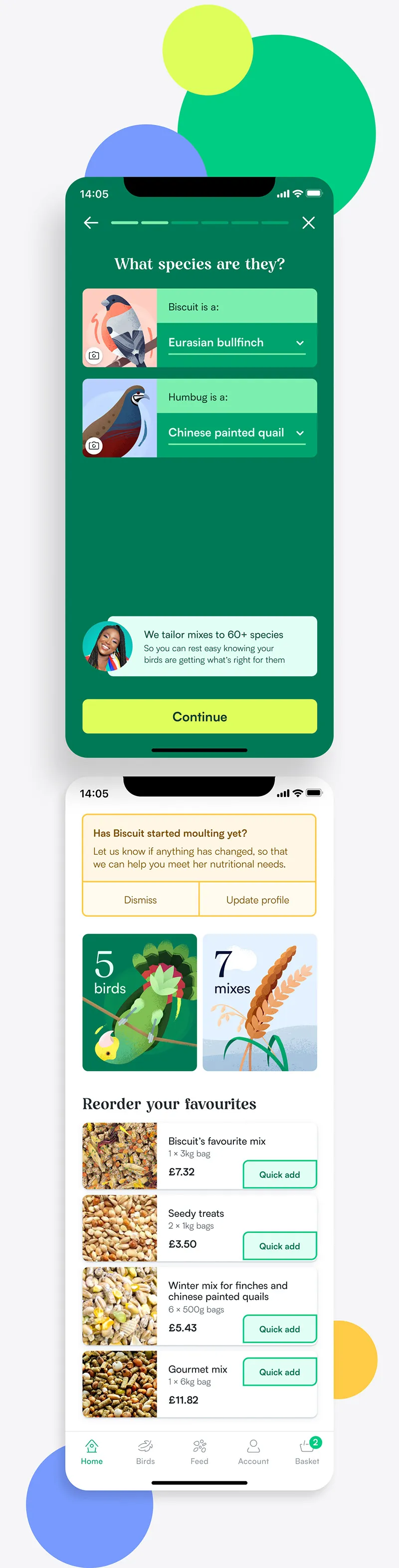
I iterated on the low fidelity designs once more, ensuring a solid foundation for the visual design stage. Changes included enlarging and positioning all the "add new" buttons consistently, and revising the wording to be a clearer call to action.
Kicking it up to high fidelity
I started moving into visual design by collecting references, research, and inspiration for the brand look and feel. I knew fresh, organic ingredients are important to my users, and I wanted the visual language to reflect this feeling of clean vibrancy and quality.
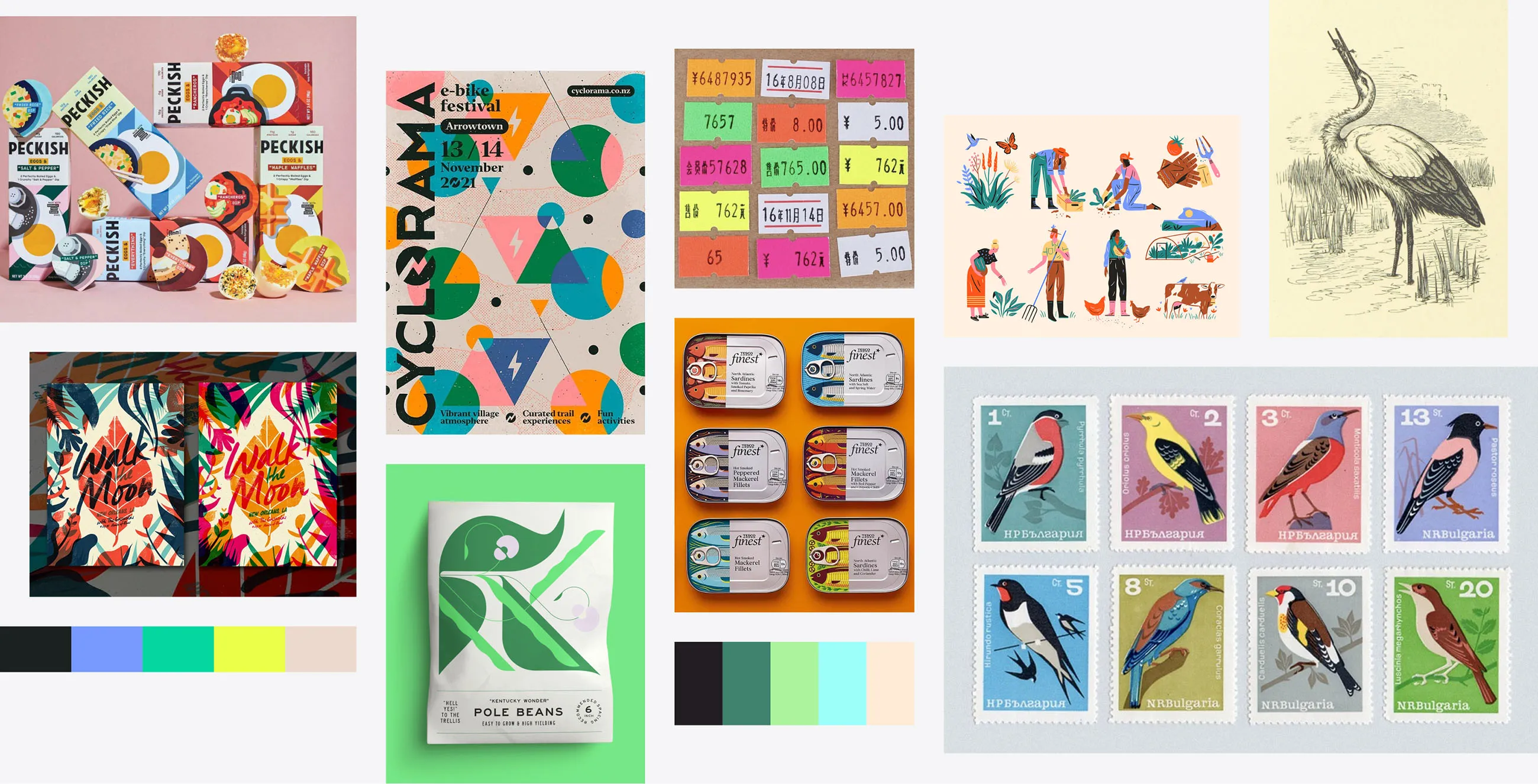
I created a space for loose exploration where I could test colour palettes, type pairing, component styles, and a lot of different layouts for key screens. The process was largely non-linear—trying some combinations, then returning to my research, before going back to adjust styles and exploring another direction.
Periodically reviewing Apple's Human Interface Guidelines to make sure users would find the app immediately familiar and usable, I pulled together a cohesive "version 1.0" of the full app.
Visual design is not a colour-by-numbers exercise
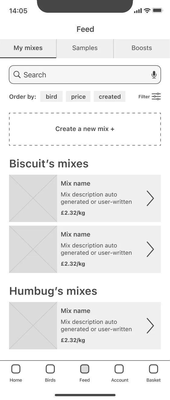
I made several changes from the wireframes to improve usability. The blog and articles weren't adding much except clutter—instead, I banked it as a potential feature for the third persona to be implemented further down the roadmap. I also added an option to specify whether a mix would be used for treats, supplementary feed or a complete feed, based on Mehreen’s desire to include fresh food too.
I made plenty of tweaks to simplify features and provide better user control. I examined the flexibility and development feasibility of each component, and ensured tone and style were consistent in the copy and micro-copy.
Let's break down some visual choices
Colours
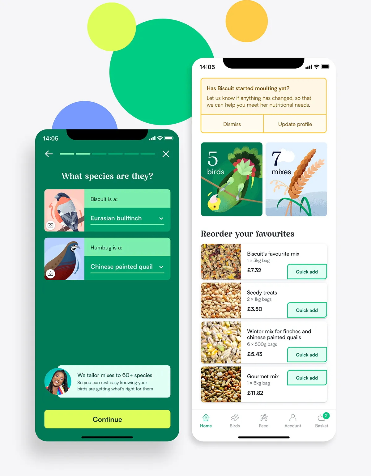
A bright palette reflects vibrant plumage, with text colours chosen for readability, using luminance and weight to boost visual contrast, more closely conforming to APCA.
High-attention flows such as bird creation, are more stylised for a focussed experience. Functional or content-heavy screens use lighter, airier colours to help scannability and ease cognitive load.
Typography
Headings are set in Jessi Neue, an organic display face with a lot of personality to assist brand recognition. This is offset with Satoshi, a geometric sans-serif with good legibility, for smaller headings, body, and labels.
Hierarchy is created through a number of weights, sizes and colour combinations, and enforced with clearly defined styles.
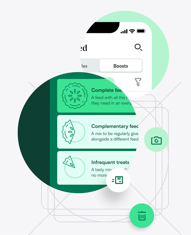
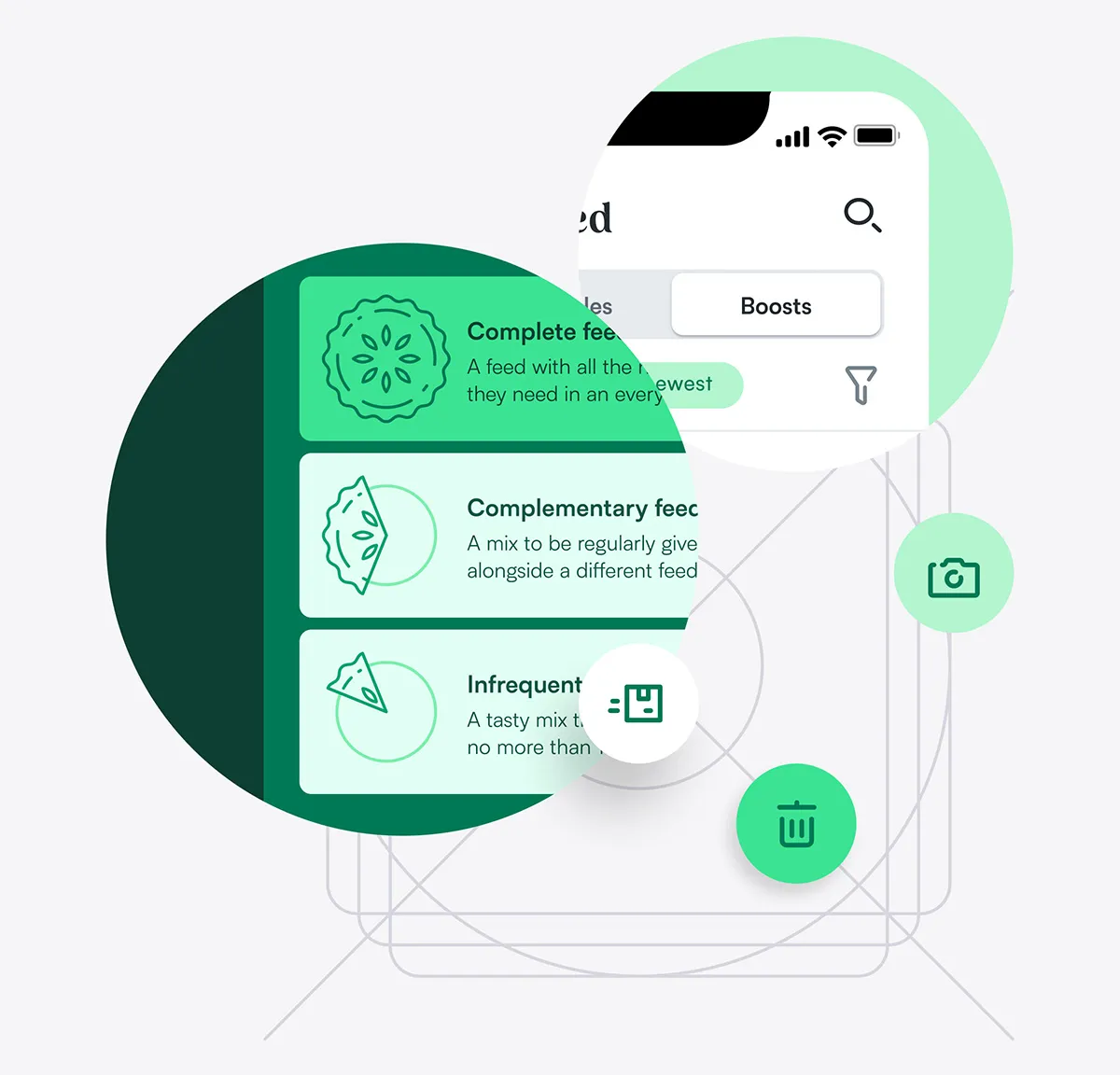
Iconography
Icons are built in four sizes for different uses, each re-drawn with varying levels of detail.
Tab bar icons are an airy, open, 1px outline style that are filled when active. Functional icons are slightly heavier for visual balance, as they often appear in isolation.
Some icons are closer to spot illustrations, to help explain the concepts they represent.
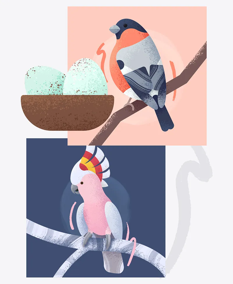
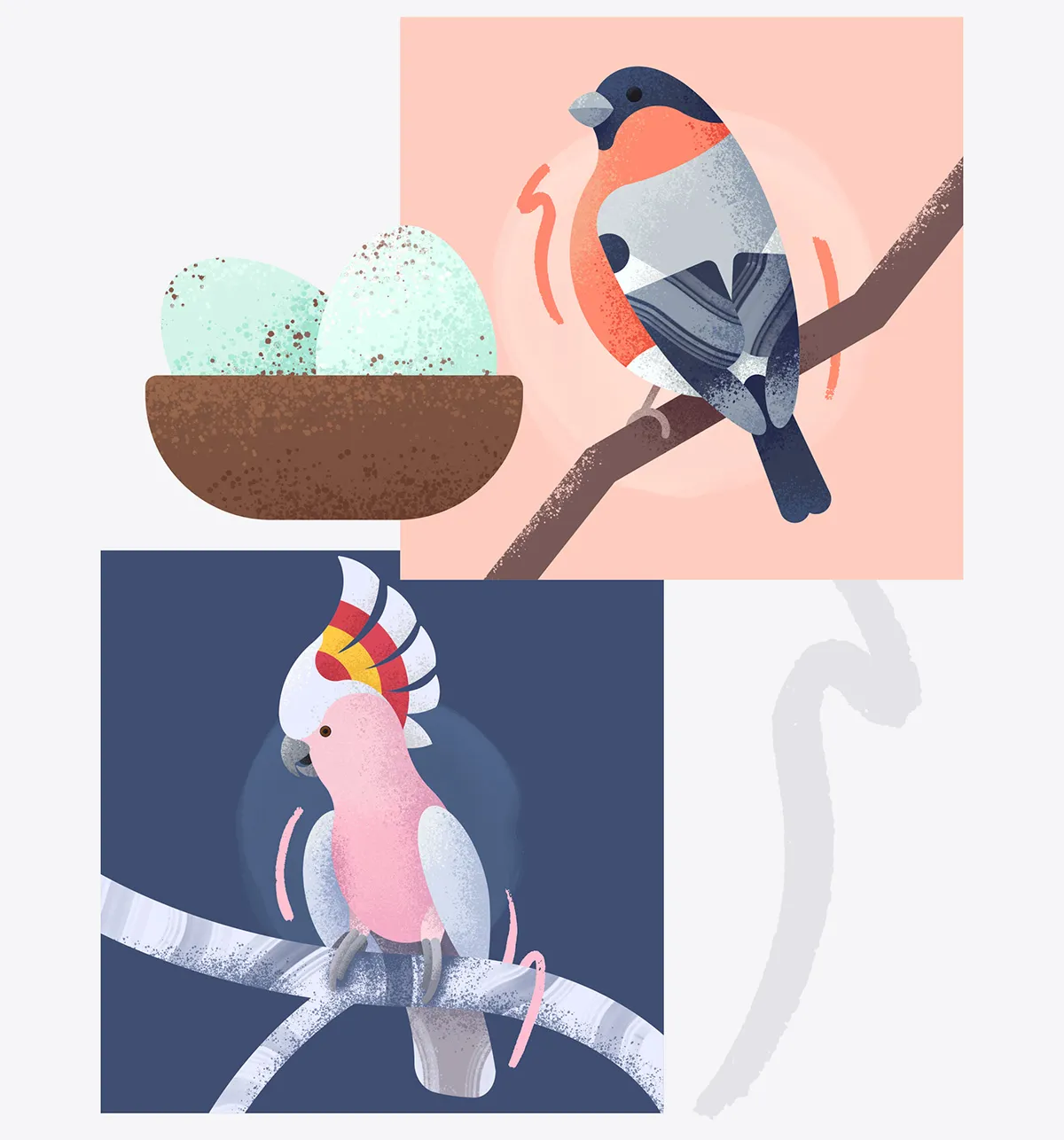
Illustration
Bespoke illustrations are used as default images for birds and groups, and as accents for certain screens and packaging.
Colours and styles reference the brand language, even mirroring the geometric shapes of Satoshi and the organic lines in Jessi Neue.
Components and grids
A soft 8pt grid combined with columns structures screens in a way that’s flexible, yet logical to develop. Spacing is kept to defined intervals, and auto layout is used when needed for speed and flexibility.
A sticker sheet (i.e. a simple design system) ensures all components and styles are consistent, and keeps track of variants such as error states.
Let’s break down
some visual choices
Colours
A bright palette reflects vibrant plumage, with text colours chosen for readability, using luminance and weight to boost visual contrast, more closely conforming to APCA.
High-attention flows such as bird creation, are more stylised for a focussed experience. Functional or content-heavy screens use lighter, airier colours to help scannability and ease cognitive load.
Typography
Headings are set in Jessi Neue, an organic display face with a lot of personality to assist brand recognition. This is offset with Satoshi, a geometric sans-serif with good legibility, for smaller headings, body, and labels.
Hierarchy is created through a number of weights, sizes and colour combinations, and enforced with clearly defined styles.
Iconography
Icons are built in four sizes for different uses, each re-drawn with varying levels of detail.
Tab bar icons are an airy, open, 1px outline style that are filled when active. Functional icons are slightly heavier for visual balance, as they often appear in isolation.
Some icons are closer to spot illustrations, to help explain the concepts they represent.
Illustration
Bespoke illustrations are used as default images for birds and groups, and as accents for certain screens and packaging.
Colours and styles reference the brand language, even mirroring the geometric shapes of Satoshi and the organic lines in Jessi Neue.
Components and grids
A soft 8pt grid combined with columns structures screens in a way that’s flexible, yet logical to develop. Spacing is kept to defined intervals, and auto layout is used when needed for speed and flexibility.
A sticker sheet (i.e. a simple design system) ensures all components and styles are consistent, and keeps track of variants such as error states.
Time to investigate
I set up a Figma prototype and sought another round of design critique. I ran a second usability study simultaneously, with the plan to implement insights from both sessions together.
Using the same tasks from the first usability study, I gathered data and feedback from 14 participants into a second affinity map. Some patterns emerged:
All participants found the “add group” button, a vast improvement on the first round of tests
3 of 14 participants tried to close the alert
10 of 14 participants used the same navigation method
(tab bar or thumbnails) for every task
7 of 14 mentioned liking the visual design without prompting (1 other felt it was too cluttered)
3 of 14 participants mentioned finding the expert guidance helpful without prompting
We can see that consistency is helping people navigate, expert guidance is a useful tool for reassurance, and seasonal alerts should be used sparingly, with an option to turn them off altogether. Future research should involved the visuals’ effects on cognitive load with a diverse participant pool.
Taking insights from critique and testing, I made a few tweaks to the designs.
Carets pointed right when closed and down when open, and could have been mistaken for buttons
Carets now point down when closed and up when open, indicating action when tapped
This included altering the accordions to more closely match the standard laid out by NNg's research on signifiers.
Ingredients opened an accordion, but nutritional breakdown opened a modal, despite both having a right-facing caret
Nutritional breakdown button was borrowed from a different screen, where it made more visual sense
Right-facing carets now differentiate from the amended accordion design seen previously
Both elements now have the same behaviour, with matching icons to emphasise this
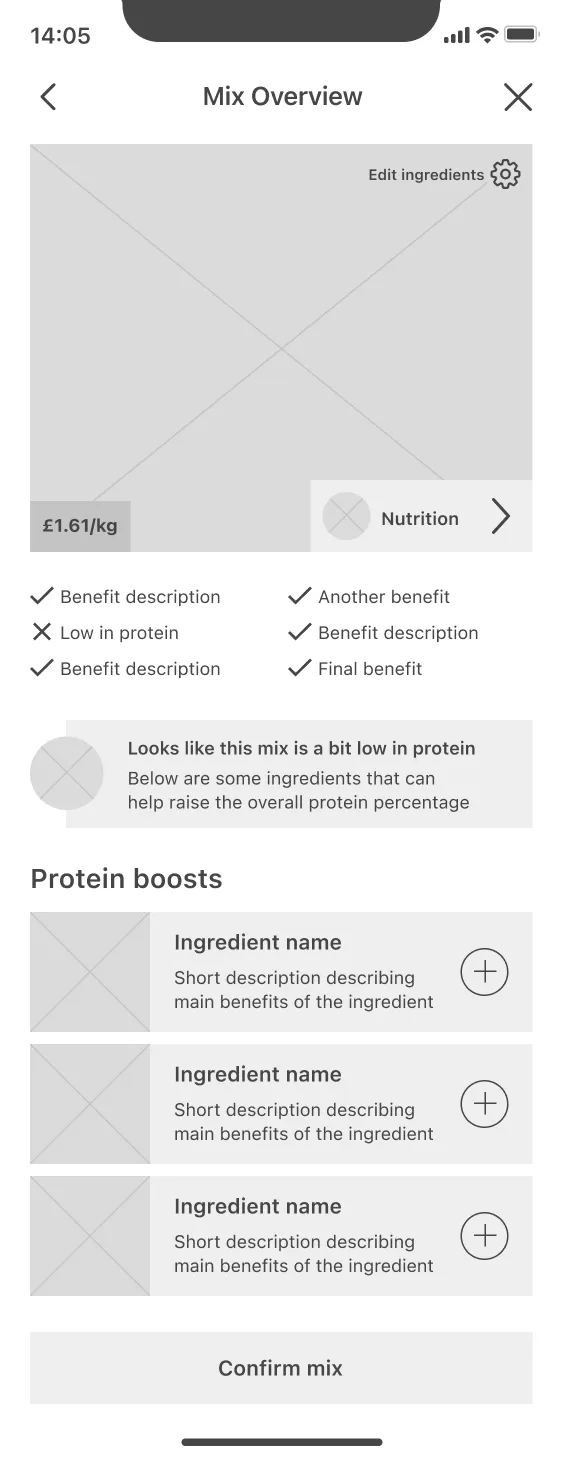
I also changed the custom mix product screen, so both the ingredients and nutrition elements look and behave similarly, reducing unexpected behaviours. A colour change creates visual feedback on the interaction.
Taking insights from critique and testing, I made a few tweaks to the designs. This included altering the accordions to more closely match the standard laid out by NNg's research on signifiers.
I also changed the custom mix product screen, so both the ingredients and nutrition elements look and behave similarly, reducing unexpected behaviours. A colour change creates visual feedback on the interaction.
Carets pointed right when closed and down when open, and could have been mistaken for buttons
Right-facing carets now differentiate from the amended accordion design seen above
Both elements now have the same behaviour, with matching icons to emphasise this
Carets now point down when closed and up when open, indicating action when tapped
Ingredients opened an accordion, but nutritional breakdown opened a modal, despite both having a right-facing caret
Nutritional breakdown button was borrowed from a different screen, where it made more visual sense
Taking a look at the full primary flow
This is the core of the app, users are able to enter into a focussed flow to create their highly custom mix, with expert guidance, and control over what exactly to order and when:
In conclusion
There are always more improvements to make, but at this point I was happy with calling the app ready to build. Users were completing tasks with ease, comprehending visual and written language, and most importantly—converting. Almost every participant was able to create and order a mix, and many mentioned that they would trust the app to help them pick the right food for their bird, which meets the original goal statement:
The app will let users who aren't satisfied with off-the-shelf products, create their own feed mix by offering complete control over the ingredients. I will measure effectiveness through usability testing low and high fidelity designs.
Personas’ problems are being solved—Mehreen has step by step guidance to find the right food for her parrot, with options to order samples to help him adapt and try new foods. David can create mixes for entire groups, and easily adjust them depending on the time of year to reduce wastage.
Future releases could account for strategic business decisions, e.g. introducing more expert guidance and knowledge banks to help new user groups who know less about their birds' needs.
After all, no product is ever truly finished…
*If you’re my landlord, this story is entirely fictional; there are no birds in my flat.